fbpx

Tag: brand identity

  • How to bring your Brand Personality to life through design

    How to bring your Brand Personality to life through design

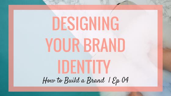
    Step 4: How to bring your Brand Personality to life through design


    Hi guys! It’s Jen here where we’re breaking down everything you need to know to build your brand. And, we are smack dab in the middle of our series with Fiverr where I am showing you how to build a brand from the bottom up in just a few short weeks. I am super super excited to share my updates with you today. If you recall, last week we went through the exercise of filling out our brand equity charts. This is the tool that really lets us get to know our brands like they’re real people – what do they do, how do they make people feel, and what kind of  personality do they have? There are so many ways this equity chart can be used but one of the biggest ways is to guide the development of your brand identity. And what do I mean by that? I simply mean the way your brand looks and talks. Otherwise said, it’s how we bring your brand personality to life through design


    Let’s unpack a little further by  starting with the way our brand looks.


    First Impressions

    Research reveals that we make a subconscious judgement about something within 90 seconds of seeing it. That means we need to make an awesome first impression every time someone encounters our brand. And an awesome first impression begins with how our brand looks or our brand design. It’s the outward expression of  our equity that brings to life our brand personality.

    The first step in developing your brand identity is to create a mood board which is a simple visual aid for bringing to life the look and feel of your brand.  An easy way to build one is with Pinterest. Just create a new board and then begin to pin pictures that you feel reflect your brand personality.

    The mood board sets the visual tone and is the source of inspiration for the core elements of your brand design like your colors and fonts.

    It’s also an awesome tool when you’re working with creatives. It can really help them understand the look and feel you’re going for.

    Which is exactly what I did this past week. Here’s my mood board:

    brand personality mood board

    While I had figured out what I wanted my brand to look like, I still didn’t have a name or logo. I turned to Fiverr for help with both of these things. So are you ready to see them, already??

    Ok – tada!

    So the name is Live Freely. And this was really inspired by this idea of the customer being freelancers and creatives and really anyone outside of the normal 9 – 5. It resonates both with who they are but also what the brand has to offer them.

    And with the logo, I really wanted to reflect that spirit of being free. Which is why we chose this script font.


    Besides influencing your logo, you can also use reference your mood board to identify your brand colors and fonts as well as and when you’re selecting images for everything from your website to an Instagram post.

    Of course, visuals are only way one to communicate with your customers. The other is through your brand voice. Seems pretty straight forward but for a lot of people finding the perfect tone of voice is actually one of the most challenging parts of the brand building process.


    So here’s my easy hack. Imagine how you’d talk to your customers if you met them at a party. Then, read out loud as if you actually are talking to them while you’re writing. I find that doing this really helps your words to come out more naturally. Another trick I like to use is to come up with a handful of signatures words and sayings which can really give your brand personality.


    At this stage we’re really starting to see our brand come to life. Next week we’re going to talk about how we use this brand identity when we develop our website and social media.


    Services Used + Cost

    I Will Give Your Product, Invention, Business or Book A Name

    brand identity brand name

    – Basic, $35
    – Medium, $65 (My choice)
    – Premium, $115

    I Will Create Your Logo and Brand Design

    brand personality logo

    – Basic, $400
    – Medium, $700
    – Premium, $1,100 (My choice)

    I Will Design A Product Package, Product Label or Product Box

    brand personality product label

    – Basic, $50
    – Medium, $50 (My choice)
    – Premium, $50

    Total: $1,215

    Total for weeks 1-4: $1,975


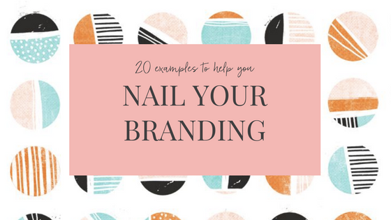
    PS: Want more tips on how to bring your brand personality to life and examples of how other brands have designed their brand identity? This post is for you.

    If you missed week 1week 2, or week 3 of this series, check them out.


    Cheers!

    Jen


  • 20 Branding Examples to Inspire your Brand

    20 Branding Examples to Inspire your Brand

    branding examples

    nail your branding

    This post will give you a simple roadmap plus loads of branding examples to help you nail your branding

    You’ve heard that great branding is important for your business. In fact, you’ve probably heard it from me. But what does great branding look like and how do you know if you’ve nailed it?  If you’re not a designer yourself, figuring this out can sometimes feel out of your league. How are you supposed to know what to do?

    I get it. I’m not a designer either.

    What I do know is that there are a few core elements that make up any great brand design. Knowing what these are and what role they play is your first step. From there, the best thing to do is look around. There are some brands out there that are really rocking in certain areas. We can look at what they’re doing and learn how to apply their best practices to our businesses.

    To help you figure out how to nail your branding, I’ve put together a list of  4 essential elements you need to consider. To top it off, I’m giving you 5 examples of brands that are masters in each of the areas. So, here you have it,  a simple roadmap to great branding and 20 examples to guide you.

    Color

    Color plays an incredibly important role in your branding. In fact, 85% of consumers cite color as the number one reason they buy a particular product (source). When selecting our brand colors we need to consider the different emotions and characteristics associated with them. Blue, for instance, is often associated with feelings of trust and security while red tends to be associated with power and passion.  The colors you choose should give your customers a feel for your personality and the way you want your brand to make them feel.

    Color also plays a helpful role in making our brands recognizable and memorable. One study reported that color increased brand recognition by as much as 80% (Source). The key is to pick a signature color that really stands out.

    Here are 5 brands who have mastered the technique:


    DRYBAR

    drybar-branding

    Drybar has three primary brand colors: white, grey, and yellow. It’s the yellow that is their signature. In fact, they’ve given it a name: buttercup.


    THE HONEST COMPANY

    honest company branding

    The Honest Company uses a bright color palette that is attractive to its target audience of moms. And, their signature blue creates a sense of trust and reflects their brand name.


    SUGARFINA

    sugarfina branding

    Sugarfina’s blue boxes can’t be mistaken. The color pops and makes the packaging and the brand memorable.


    GLOSSIER

    glossier branding

    Glossier pink is a thing. The brand has adopted the color which appeals to their female target and also gives the brand a signature on and off the shelf.


    SOULCYCLE

    soulcycle branding

    Like Drybar, Soulcycle has adopted a relatively simple color palette. Their use of yellow on everything from their bikes, to their logos, to their walls though is what makes the brand stand out.


    Fonts/ Typography

    Just like color, each font carries a unique personality. Fonts can exhibit a feeling of elegance, tradition, modernity, creativity, and even nostalgia. Many fonts even carry historic or cultural contexts that gives them a deeper level of meaning. Recall classic fonts like Times New Roman, Comic Sans, and Impact and I’m certain each will evoke a different feeling.

    Your selection of fonts plays a big role in bringing out your brand’s identity. You want to make choices that reflect your personality however this should not be the only consideration.  You also want to ensure your font selections are legible and flexible enough to be used consistently.

    Here are 5 brands who are using typography the right way:


    JENI’S SPLENDID ICE CREAMS

    jenis ice cream branding

    Jeni’s logo looks as if Jeni signed it herself and the font on her pints is reminiscent of a handwritten note. The combination gives you the feeling that the pints are personal and homemade. It’s not by chance, this is exactly what the brand wants you to feel.


    THE FLEX COMPANY

    The Flex Company branding

    Flex creates period products with the aim is to elevate the experience. Their choice of fonts does just that. The combination of clean lines and script is decidedly sophisticated.


    THE JUNGALOW

    The Jungalow branding

    Without knowing anything else about the company, you get a great sense of what The Jungalow is about just by looking at their logo. The organic textures and slightly messy font let you know that the brand is free-spirited.


    SPRINKLES

    sprinkles branding

    Sprinkles script and sans serif font is a perfect pairing. The script gives charm and delight to the logo while the sans serif creates balance and can be used everywhere from their website to their cupcakes.


    HEDLEY & BENNETT

    hedley and bennett branding

    Hedley & Bennett nails it with the emphasis on their & in their typographic logo. It turns the symbol into an icon that the brand is able to use to subtly brand their products.


    Visuals

    Your brand visuals are the images that you use in all of your brand materials including your website, social media, and advertising.  They are a powerful tool for bringing to life your brand identity. For that reason, your visual style should reflect the same personality evoked through your choice of colors and fonts.

    Beautiful visuals can also play a critical role in capturing and keeping the attention of your customers. You want to develop a unique style that connects with them and tells them something about your brand.

    Take a look at how these 5 brands are using visuals to show rather than just tell their customers what they’re about:


    OUTDOOR VOICES

    outdoor voices branding

    Outdoor Voices wants you to get outside and do something with someone. For them, it’s not about performance or competition but rather recreation. This idea is embodied in their visuals which show a diverse group of people, in action, doing the things they love together.


    S’WELL

    swell branding

    S’well has a mission to rid the world of plastic water bottles. They want you to bring your S’well bottle with you wherever you go. Their visuals support the idea by showing off S’well bottles in all sorts of scenarios.


    LAUREL & WOLF

    laurel and wolf branding

    Laurel & Wolf wants to make the luxury of an interior designer available to everyone. Though they’ve democratized the service they still want to maintain the high-end appeal. Their visuals help them do just that.


    AWAY

    Away branding

    Away wants you to get out and explore. Their visuals don’t just depict their product. They inspire you to take them with you on a great adventure.


    SAKARA

    Sakara branding

    Sakara wants to help you feel lighter and brighter. That same idea comes through loud and clear when you look at their bright, white, visual style.


    Language

    How you communicate with your customers is just as important as what you communicate. The right selection of colors, fonts, and visuals will fall short if not pulled together with the right message.

    Your choice of words not only help bring out your brand’s personality but also establish the type of relationship you have with your customers. It can even help to build a sense of community between them.

    Take a look at how these 5 brands have unified their design through an identifiable brand language:


    DRAPER JAMES

    draper james branding

    Reese Witherspoon’s brand Draper James is all about honoring her Southern Heritage. The language she uses purposefully has a distinctive Southern charm that really draws out the brand’s personality.


    GIRLBOSS

    Girlboss branding

    GirlBoss, the movement created by NastyGal founder Sophia Amoruso is all about empowering women. The language they use drives that forward with a strong feminist tone.


    THE SKIMM

    the skimm branding

    The Skimm wants to make it easier for you to live smarter. That’s why they deliver the facts to their audience in a language they actually understand and care about – including in a lot of pop-culture references.


    BAN.DŌ

    bando branding

    Ban.dō is a lifestyle brand that is serious about fun. It’s not hard to believe them when you see the catchy phrases they use across their products and the relatable tone they use on their website.


    DARLING MAGAZINE

    Darling Magazine branding

    Darling is a media platform that wants to share the art of being a woman. Their modern manifesto makes that clear. As does the way they title the women they profile with names like The Confidant, The Dreamer,  and The Explorer.


    Branding Wrap Up

    You don’t have to be a designer to know how to think like one. When you’re planning the branding for your business start with your colors, fonts, visuals, and language. Consider how the four will play off one another and how together they can best bring to life your brand personality.  Not sure what that is? Start with this free guide and you’ll be ready to rock ‘n roll.

    branding examples

    Which brand’s design do you admire the most? Do you have any you’d add to the list? Comment below to let me know!

    A toast to you,

    Jen